Final exam: What is Big Data? And why it is so hard to define it?
Big data is a Mac truck with the speed of a NASCAR. This sounds completely awesome until you think about it for a second. The amount of data generated on earth is growing exponentially. Retailers are compiling databases with customer information with every swipe of the card. Organizations in logistics, finance, health data, as well as, many other sectors are also capturing more data. Social media has the public at large creating vase quantities of digital material. The government and private organizations collect data for the purpose of visual recognition, as well as, many other types of data bases. Not to mention that even our appliances have Wi-Fi now. In addition to all of this data, technology is also unearthing large and complex data sets such as the human genome.
The flow of data is so fast and furious at this point that some companies have to sit back and watch valuable data go un-minded, as their systems just cannot keep up. And here in lies the big problem with big data. Our ability to gather data is far beyond our ability to process it.
What is Big Data? I think it is more correct to ask what big data are: New technics that generate value from very large data sets that cannot be analyzed with traditional technics. These technics have opened a virtual Pandora Box of information. Much like so many other complex ideas – it is easier to say what big data are like, as opposed to, what they are. And the reason for that is well……we are just not really sure.
What we are sure about when it comes to big data is this- It’s big, I mean really big. The sheer volume of data is the greatest challenge, as well as, its greatest opportunity. There is too much of it for any traditional relational data base. Global internet traffic is getting close to the five zettabyte mark, per year. There is no doubt that with the ability to harness all of that information – we could be a far more productive and reliable society.
In addition to the being big, big data is also fast. The velocity of flow of data across a modern day server is often too great to be anywhere close to 100% useful. Epically for a growing consumer base that is accustomed to real time information.
Another V that describes what big data is like also describes why it is so hard to define. The Variety of big data is far greater that anything we could have imagined, just a few decades ago. Whereas, the traditional data were things like document, financial report, stick info and personnel files - todays data consists mostly of photos, audio/video, 3D models, simulations and location data. This unstructured data is difficult to even categorize, none the less, process.
On my personal journey through the world of big data this semester; I think the most impressive software I found was Hadoop. Hadoop is an open source software library for a reliable, scalable, distributed computing. It was the first reliable platform for big data analytics. One of the most well-known users of Hadoop is Linked In. They have taken advantage of the speed afforded by the process of distributive computing. This is where the data is sent to multiple servers or clusters of servers for processing before the information is sent back.
If there is one thing that I have learned about this semester that has me optimistic about the future of computing; it’s the idea of quantum computing. Hough only theoretical at this point, they should excel at computing the massive unstructured data sets, because they would compute using quantum mechanics states.
.
One may be included to wonder what the big deal is with big data. Well, the upside of being able to accurately analyze data could make a world of difference for a large portion of the world’s population. Big data provides opportunity and insight in to new and emerging types of data. Whereas in the past the human body would give off more information that a human body could compute. In the future this may not be the case
Oracle stated that “big data holds the promise of giving enterprises deeper insight into their customers, partners and business”. And this is a good thing for everyone involved. It means less overhead and thus lower prices. The McKinsey Global institute states that “the US health care sector could achieve an estimated saving of 300 billion dollars a year, by way of increasing efficiency and quality”.
Big data may if fact is able to pride help to sectors far from Silicon Valley or Wall St. Big data could help help farmers accurately forecast wither and prevent crop failures. It could help prevent a pandemic or maybe even a war
The McKinsey Global institute states that the US health care sector could achieve an estimated saving of 300 billion dollars a year, by way of increasing efficiency and quality
Sunday, April 26, 2015
Monday, April 6, 2015
What Makes Visualization So Important To Researchers of Big Data?
I think the first reason that visualization is so important to researchers has to do with just how big, big data is. For example: one would find it difficult to express data quantitatively with just a number standing by itself. Regardless of how big that number is; without anything to compare it to – it would be hard for one to wrap their brain around it. So, if someone were to provide a number to represent the amount of stars in the sky, that number would first off, quickly be forgotten, but more importantly, it would not have been fully understood in the first place. Now, if you were to show a graph comparing the number of stars in the sky to grains of sand on earth to the number of people on earth – this would provide context and that is one thing that visualization can do quickly and in a way that can be easily remembered.
The human brain works best as a pattern recognizer/trend spotter. This is a tendency that has been honed over the years, since our days as hunter gathers. Despite being a species that rarely hunts or gathers anymore, the tendency persists in our cognitive functions and is the main reason why we respond so well to visualization – it is just easier to spot the patterns when given information in visual form as compared to hearing or reading it in text.
Properly visualizing data (thus, properly understanding it) is imperative to the process of collecting and refining data. Without the use of visual aids such as a statistical distribution graph, a data scientist would find it difficult to properly understand the data that they are working with, in a timely manner. But, with these tools, one could for example quickly find the statistical properties of the data set that they are working with.
Additionally, visualization can allow people who many not be savvy to a particular process, still be able to obtain a reasonable understanding of it in a relatively quick amount of time. For example: one may not know the ins and outs of a financial report, but if they see a bar labeled expenses that is taller than the bar labeled income – even a novice will be able to understand that the business is in the black.
Now, there is no doubt that visualization is the best way to convey information in the digestible form, but that is not to say that the visualization process is in itself easy. In order to maximize the benefits; a whole array of professionals have contributed to the art of visualization. This has been done over the years with the help of psychologists, statisticians and computer scientists. One important factor is that of aesthetics. The colors, shapes and placement of objects must be done in such a way that it is easy to read and draws the viewer to the areas where the information is associating with metrics or other information. In order to be able to decode the information quickly.
In addition to aesthetics, the type of graph that is chosen for particular data is also very important. A data scientist could not practically provide time series information as well with a pie chart, comparedto an index chart. Some types of information can be aggregated together on a chart, while other information is best interpreted if it stands alone, like a histogram.
And that is why visualization to so important to people that works in big data. Because they are not only using it to their jobs better, but also to better articulate their findings to the main audience of that data. Data scientists need a way to bridge the gap of knowledge when it comes to big data; whether internally or externally. And visualization tools are the best tools for that job.
ggplot in R
For the purpose of this project; I will be using the diamond data from the ggplot library. I’ve decided to just use the order factor variable of cut (Good, Very Good, Premium, Fair and Ideal) for my graphs.

I then realized that I really don’t have a strong knowledge of what exactly a factor is within R. So, I took advantage of the help function in R to read up on it.


Ok, so now that I am a little wiser on the data I am working with – I am going to attempt to plot the data that I have selected. I have selected the head function to return the top six objects (diamonds), from the data set “diamonds”, by the aesthetics of their cuts.

Now, I have to decide what type of plot to use. For this, I am going to reference the suggest website of http://docs.ggplot2.org. I initially tried using “geom_area” to get an area plot (see below), but R gave be a blank page in return.


So, now I am going to try to do a histogram. I’m not sure if I have to re-load the “head (diamonds)”, but I did it anyway and got the return I was looking for.


Alright, it looks like I am on the right track here as I see that all five of the variables are represented on the histogram; and they are ordered as I expected them to be.
Despite the area plot not working, I want to try at least one other type before I move on to trying out different colors. I first tried a bar plot, but that looked just like the histogram. So, I got the density graph (whatever that is) to work also. And again, everything appears to be in order.


Alright, I’m going back to the histogram now. But, I am going to add the variable of clarity to cut, along with a color fill to (hopefully) present a histogram that shows both cut and clarity overlapped on the graph.


I’m pretty happy with the above graph. It shows the diamonds grouped by clarity along the x axis and has the cuts for each of those clarities represented by the colors with a legend on the right hand side.
Sunday, March 29, 2015
Week 11 summary
Alright, so, I tried to follow along, but hit a road block with the codding. I’m really not sure where I went wrong as I copied and pasted straight from the blog.

Here is what I did gather about predictive analytics from the module and the blog. First off, it’s not easy. I am not sure if this would be true for all data or if this was particular to the stock market or just Apple stock in particular. I recall reading in the book “The Ascent of Money” by Niall Ferguson, about how a few people came up with a logarithm to crack the stock market. It worked…until it didn’t. That is to say that it worked for a while, only to have it fail as spectacularly as it once succeeded. Perhaps this is a testament to the limitations of predictive analytics; whether that is a permanent or temporary situation. Let’s say it was temporary. What then? What happens when the stock market gets cracked? This is an interesting thing to ponder. What happens when a system that is to such a high degree reactionary, gets predictable? Do we end up with one of those unstoppable forces V. the unmovable object scenarios? This isn’t a topic that has been discussed yet in any of my courses and perhaps I am getting ahead of myself, but I can’t help but wonder – how predictive can analytics get? And in situations where the prediction can affect the predicted; is that a bad thing?
Alight, back on task, here. The process by which the Apple stock was attempted to be predicted seemed pretty solid to me. Step one, gather the data. This part seems pretty straight forward and relatively easy as stock market data is regularly tracked and recorded. Once gathered, the data was narrowed down. This seems reasonable as the less data one has, the easier it is to work with. Choosing other stocks that seem to correlate with Apple, does not strike me as the plan though, as this can only be historical and could not account for future goings on. Furthermore, I one is going to go this route- why not just use the beta value, as this is common stat that can be obtained without any further analysis. The method of clustering did not yield stellar results. Perhaps this had to do with the lack of for cite when choosing the other stocks to cluster it with. The Linear Models also did not yield good results, as did the support vectors, and the classification trees. This all makes me wonder about what type of data is even the right type of data to yield productive analytics and what data should not even be attempted to be analyzed predictively. Perhaps that will be covered in the next class.
Sunday, March 22, 2015
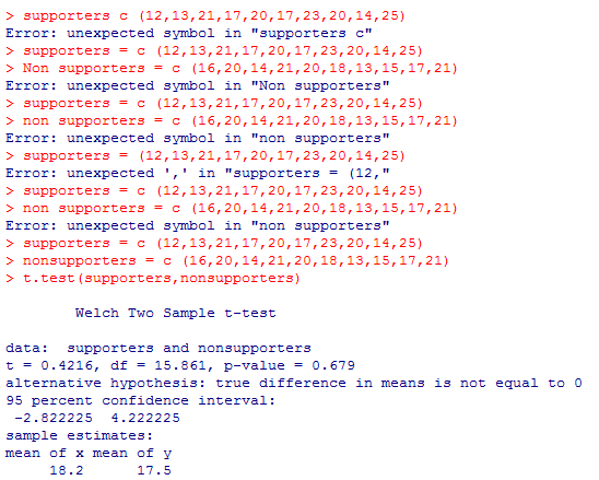
T.test in R
When comparing two sets of data; it is important to first know if the two sets are significantly different from one another. Fore, if they are not, there is no real point in comparing them. This is where a T test comes in. A T test will provide a hypothesis, such as - the means of the two data sets are different; and then test that hypothesis.
Upon assignment I preformed a T test with the following two data sets:
> supporters = c(12,13,21,17,20,17,23,20,14,25)
> Non supporters = c(16,20,14,21,20,18,13,15,17,21).
These sets represent samples of a population of 150,000 and their opinions about support for a congressman's idea regarding libraries.
The importance here is not the particular data, but the process by which it can be analyzed using R.
As the results below show, R can be used to run a T test by entering the data sets and then typing "t.test" and hitting enter. As the screen shot shows, it is important to not leave a space when you data set name has more than one word in it.
Sunday, March 15, 2015


Thursday, March 12, 2015
Summary of Characteristics and Attributes of machine leaning
I have to disagree with Mr. Kobielus’s analogy of log data to dark matter. Despite the 3 V’s of log data in the world today being beyond the scope of human comprehension – with machine learning, log data becomes palatable, whereas, dark matter is incomprehensible despite our best technological efforts to quantify it. This is not to say that on face value, both are not equally mysterious. Much like the mysteries of the cosmos, predictive data lost in a sea of data seems illusory to the human eye.
Despite the short coming of the human ability; it has provided the tools with which we can corral this seemingly infinite data. By way of algorithms, computers can not only detect important data sets missed by human eye, but it can also learn to become more proficient and finding those sets. Perhaps the best way to go about this process is unsupervised learning. This is the process by which a computer will cluster, compress and summarize data, so that a human mind can begin to comprehend it.
Despite the cold and unhuman sound of the name “machine learning”; Hanna Wallach outlines how it can provide some very human results. She also, attempts to clarify what exactly big data is. For example: how does big data as we know it differ from large amounts of data that would come from the field of partial physics? Hanna sources a few quotes for the definition of big data – the best of which is – the amassing of huge amounts of statistical information on social and economic trends and human behavior. In other words, as she states “unlike data sets arising in physics, the data sets that typically fall under the big data umbrella are about people…”. I think this is the crux of big data and many people may miss this.
One way that machine learning can in some ways be more human than human; is in now it can find smaller subsets within large amounts of data. For example: minority members of populations might not be well represented in a set, but people are still interested in learning what their statistics have to tell us. Machine learning can drill down into the data to discover and analyze these small sets for that purpose. Whereas, a human eye or even recent technologies would find it difficult to sift through to find the data that represents minorities. Hanna describes this process as granulizing the data – meaning that it is looked upon from a micro, as well as, a macro level.
The overarching theme of Hanna message is that in order to provide real improvement to our society via data mining; social sciences will need to be combined with computer science. And prioritizing social questions over data availability. She suggests a question driven approach, instead of working inductive or deductively from the data itself. She feels that this is the best way to avoid missing information of small granular size.
Perhaps the best models for obtaining the goal of social improvement through data mining are exploratory and explanatory ones. It is through these models, that the typical model of prediction can be achieved; when dealing with highly granulated data such as that of minorities in a large population. Unfortunately, human biases will play into these as well.
Another important aspect of Hanna’s message is that of the uncertainty that comes with the minorities of a data set. She feels that uncertainty should be expressed in order to properly account for those smaller data sets within a large one. Luckily many machine learning methods do just that.
Monday, February 23, 2015
Summary
Everything You wanted to Know About Data Mining but were afraid to ask
In much the same way that technology in general has shrunk the world; the outgrowth of that technology known as data mining has shrunk our ability to discern information about people based on their actions. Whereas is the past it would take a one on one personal relationship to know your customer; today, we know plenty about our customers without have to even know their names. It is this monetization of data that is truly driving its progress.
When working with very small amounts of data, anomalies and patterns are relatively apparent. But, when applying those same intuitive processes to big data; one would be looking for a needle in the preverbal haystack. Enter big data – the process of drilling down and threw large amounts of data in order to find a pattern, cluster, relationship or hell anything that has predictive capabilities. This is where the money is at. Once one can make a reasonable prediction, the rest is just directing marking efforts in the same direction.
The methods vary; whether it is association learning, cluster detection or classification; one thing is for sure – with so much value to be had – there is no end in sight for big data analysis.
Big data blues: the dangers of data mining
It is quite possible that data mining will start to see diminishing returns at the same point that customers become uncomfortable with personal information being collected. We certainly aren’t there yet, as the majority of people consent (although many times indirectly) to the use of their data for business purposes. This may however, not always is the case.
The best way to avoid any potential customer blowback is for a company to be honest about what data they are collecting and what they are doing with it. Some companies have gone so far as to the make this information publically available online. The inverse of that would be for a company to be collecting/using data in a way that would offend a customer, while hiding that fact. This could and has had negative effects on business/customer relations.
Another issue that arises is the complexity of the policies that many companies have. For example: does anyone really read those policy disclosures or do we all just skip to the end and accept. Even if one did read the entire policy; would they understand it? Chances are that unless that person has some professional expertise – no. This raises a question of fairness as a concerned consumer may not even have the ability to be an informed consumer.
Despite these shortcomings – data mining is a mutually beneficial practice that streamlines both the consumer and business experience. For these reasons many are confident that there can be an agreement reached between business and consumer that will allow both parties to be comfortable. This will most likely come in the form of standardized codes of conduct for businesses to follow. Standardized codes would be good because instead of consumer having to understand the policies of each and every business that they deal with – they will just need to be familiar with the code of conduct. And as long as the business lives up to these codes – all will be well. This will take action on the part of the consumer in the event of a breach of these codes, because if people can get away with braking them; they will.
Subscribe to:
Posts (Atom)